The Psychology of Color
The psychology of color plays an essential role in the way that products are viewed by consumers. What does this mean? Marketers need to take the time to understand the importance and impact of color when it comes to labeling and brand identity. A brands impact on consumers can be heavily swayed by color, font, and calls to action on a products labels.
There are other important elements to consider when you are choosing your
label materials, and one of them is matching the colors used on the label to the actual package design. You do not want your label to clash with the packaging, so choosing the best colors that look good together is a factor.
Colors and Influence
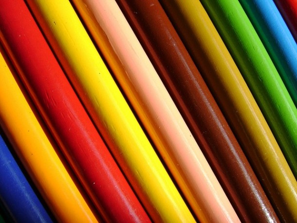
Red
One of the boldest colors to use in your label design is red. It can help your product stand out when sitting next to competitors products. Red is associated with impulse buying, excitement, and warmth.
Blue
Blue is associated with trust and reliability, as well as feelings of calmness and security. This makes it another one of the more popular colors to be used in different types of design. Blue is also the color that is commonly preferred by men.
Orange
Orange is said to create feelings of warmth and vitality, and is also tied to excitement and adventure. It is an energetic color, which is why it invokes positive, warm emotions.
Green
These days green is often associated with the environment and eco-friendly products, and many people that energy conscious are attracted to the color. Green is also associated with feelings of good luck and tranquility. Green is thought to relieve stress and can create a calming effect for consumers.
White
White is another popular color because of its simplicity and it will match well with any other color. It represents purity, cleanliness, and simplicity.
Yellow
Yellow is the most attention grabbing color that there is, this is because it is the most visible color when used for design. It is associated with cheerful and warm emotions. It is important to not over use yellow in design, because too much of it can have a negative impact because it causes fatigue to the eyes.
Brown
Brown is another color that is often associated with natural products, and it can create feelings of comfort and security.
Other Factors to Remember
- Actual Package Color (or product color if clear)
When choosing colors for your
label printing you need to make sure that the colors you choose will be compatible with the actual package color. If the packaging that your brand is clear then you need to make sure that the label colors are compatible with the color of the actual product.
The font is another element that needs to be considered. It should be an easy to read font, and it should also be big enough so people are not straining their eyes to read it. Legibility is a very important factor in all different areas of design, because if people cannot read the product label, they most likely will not buy it.