Need help? We’re here!
Our expert customer service team is ready to help you with any questions or concerns you may have. Real time help is available Monday through Friday 9AM - 6PM EST- (888) 391-7165
- Chat live with support
- support@sheetlabels.com

At SheetLabels.com, customers can request samples of all of the products we currently offer.
Order Free Samples 
What's the most important aspect of label design? Some may say it's creating a visually appealing look, or using eye-catching imagery. Others may say it's incorporating signature brand elements, or sticking to a recognizable color palette. While these are all important and effective means of creating a winning label design, there are a few other crucial elements to consider. This includes fundamental details like legibility (or readability).
It's easy to overlook details like legibility when working to create a cohesive label design. However, legibility is extremely important. No matter how visually appealing your label looks, if the text on it is difficult to read or even illegible, it can cost you greatly. Customers are unlikely to purchase a product with illegible text on the packaging, especially if the text contains important information such as instructions or ingredients. This makes it easy to lose potential sales as customers may turn to competitors with clear, easy to read labels instead. Want to prevent this from happening? Follow our top 3 tips below to ensure your labels are easy to read.
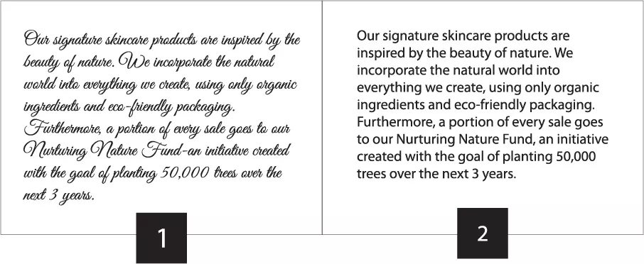
While you may be tempted to choose a more intricate, stylized font for your label, we recommend going with a simpler choice for larger chunks of text. As shown in the example below, the more basic font on the right is much easier to read than the cursive font on the left, especially when used in a paragraph format. While the cursive font is still legible, it takes much more effort to read, which can deter potential customers. The less time required to read your label, the better.
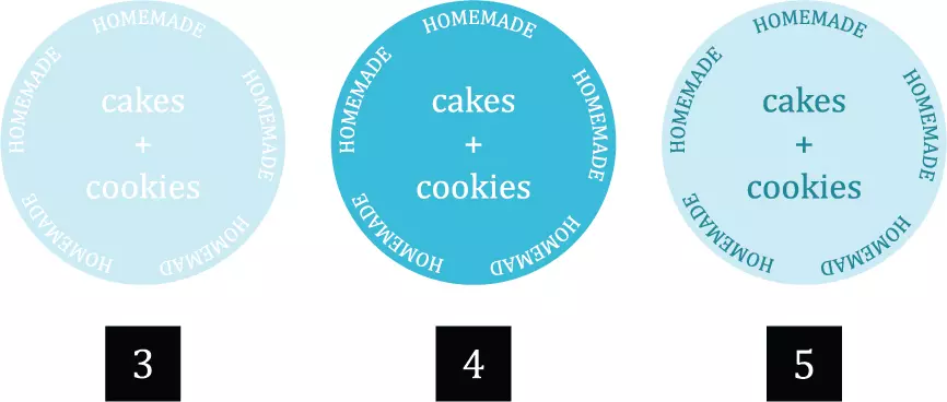
Now that you've chosen a font, it's time to decide on color. Color plays an important role in the legibility of your text and is another essential factor to consider. While you may want to choose a color that matches the rest of your label design, it's better to go with a contrasting color instead. As you can see in the example below, the first label on the left (#3) has white text on a light blue background. Having two light colors (white and light blue) on top of each other makes the text difficult to read due to the lack of contrast. To ensure your text is legible, you'll want to place light colored text on a dark background or vice versa, such as in labels #4 and #5 below. The contrast between the text and background colors make the text much easier to read and gives a more striking appearance.
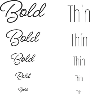
While it's completely fine to use more stylized or fun fonts on your label, it's important to use them sparingly and in the right way. Like we discussed in Tip #1, you want to avoid using these types of fonts in dense paragraphs or longer sentences. Instead, stick with using them to highlight individual words, titles, or your brand name. Along with this, you want to ensure your text is large enough to be legible in these more intricate typefaces. As shown in the example below, stylized fonts such as cursives or thin typefaces are much easier to read when larger and can quickly become illegible when shrunk down, much more than a basic typeface would.
Looking for more guidance? The printing experts at SheetLabels.com would be happy to assist you! Check out our Help Center for more FAQs and artwork guidelines or contact Sheet Labels today.