Need help? We’re here!
Our expert customer service team is ready to help you with any questions or concerns you may have. Real time help is available Monday through Friday 9AM - 6PM EST- (888) 391-7165
- Chat live with support
- support@sheetlabels.com

When it comes to selling high-end or luxury goods, your item's outer packaging should be just as high quality as the product inside. An expensive price point means the customer should be receiving the best of both worlds - a product that looks just as good as it performs. The product label is the perfect place to start when it comes to capturing this luxury look. When combined with high quality boxes, jars, or other packaging containers, your product label can be the key to ensuring your item is worthy of the top shelf.
The best place to start is with the artwork on your label. While there are no exact rules or restrictions you need to follow, there are a few tips and tricks you can use to achieve a high-end look with your label design. Keep in mind that all these tips can be adapted to fit your specific brand or product.

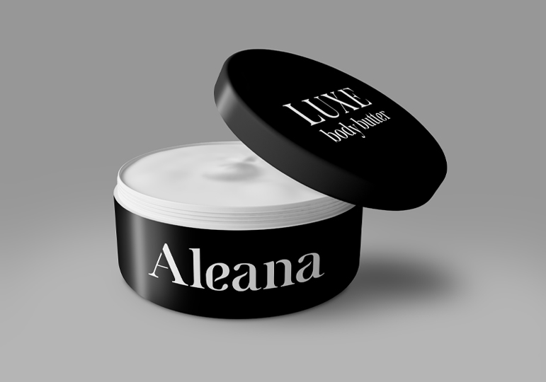
Using a limited color palette is a common practice among many luxury companies, especially within the fashion and beauty industries. Things like logos, branding, and packaging will often be limited to black and white or other neutral colors. Think of companies like Vogue, Chanel, or Prada, for example. Their logos all consist of simple black text on a plain white background. This minimalist type of design ensures that the brand name will stand out on the stark white background, while the black text appears bold and weighty to the eye. The limited colors also add a feel of sleekness, which further pushes the overall luxurious look.
Along with black and white, it's also common for luxury companies to include a single, signature color in their packaging. The best example of this is Tiffany with their classic blue boxes. The signature blue color makes the brand instantly recognizable while the black logo on the box keeps everything looking clean and elegant.
Another way to use a limited color palette is through monochromatic design. This is done by choosing one color and designing with only tints and shades of this single color. For example, if you choose to use blue as your single color, your label design can include light blue, dark blue, navy blue, and all shades in between as long as they all belong to the blue color family.
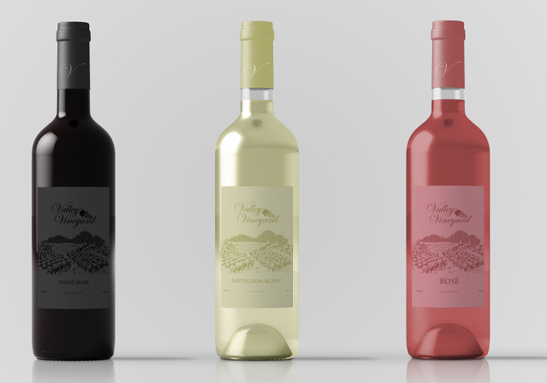
This type of color scheme gives your design the unified, put together look you want in a luxury product. You can even take this a step farther by matching your monochromatic design to the color of your product itself, as shown in the image below. Just be sure not to go overboard with the number of shades you choose. Simple is always better when it comes to high-end design.

While your product label is certainly important, you also want to give the rest of your product time to shine. A busy, overwhelming label can distract from the remainder of your packaging and take away from the high-class feel of a luxury brand. When in doubt, keep things simple and let the product speak for itself.
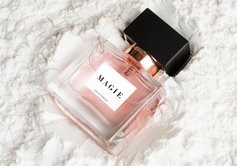
We recommend limiting the amount of elements on your label design to a few key features like your logo, the name of the product, and any important measurement or size information. This allows you to keep the size of the label small so it won't overwhelm the front of your product. You can always add more information in a separate label on the back or bottom of your product if needed. For an even more effective design, combine this tip with the previous one and stick to black and white or another limited color palette.

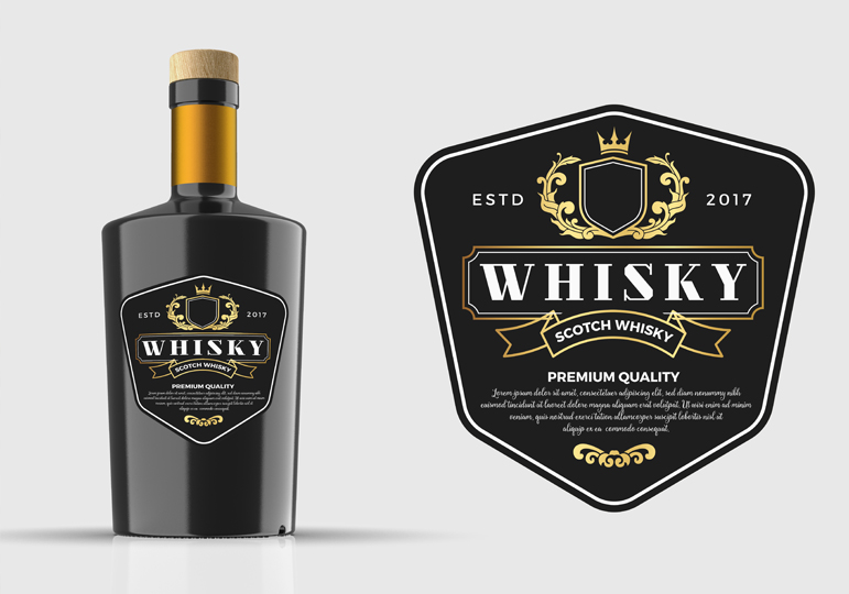
If you're looking to add a bit more personality and flair to your label, there are a number of ways to do this without taking away from the rest of your product. The first method is to add pops of metallic elements. We recommend sticking to classic metallic colors such as silver, gold, or rose gold to maintain a classy, expensive feel. Use these metallic elements sparingly to call attention to important elements of your label like your logo or to add shiny flourishes like lines and borders.
Another way to add interest to your label is through the label shape itself. Try a custom or unique shape to stand out from the crowd. Custom shapes can be especially effective for this and give your product an overall customized, luxurious look. We recommend combining both metallic elements and a custom shape to create a truly eye-catching design. Just make sure to stick to the same previous rules of simplicity and avoid overdoing either of these tips.

Once you have your label design, you'll want to ensure you choose the right material to have it printed on. When browsing materials, it's important to keep in mind both the function of your product and the artwork you're having printed on your label. The needs and requirements of both these elements need to be addressed by whatever material you choose. For example, if your product is liquid-based or will be stored in moist, damp environments, you'll need to choose a weatherproof material that can stand up to these conditions. If your label also has metallic elements, you'll also need to ensure that the material you pick has a metallic sheen to it that will allow metallic colors to print correctly.
For more guidance on selecting materials, check out our separate article here for label material selection or contact Sheet Labels' Client Services Team for more individualized assistance. We would be happy to work with you! If you'd prefer to test a few of our materials in person, click here to request free sample labels to check out our free samples.